DESCRIPTIVE ANALYSIS
At a High Level
From the data we collected, we first did some high level exploratory analysis.
Using Tableau, a visualization tool, to obtain initial insights, we split the dataset into subscribers and non-subscriber to elucidate differences on 12 specific characteristics. We decided that 0 will represented a non-subscriber and 1 will represent a subscriber. In the interests of brevity, five particular charts caught our attention.
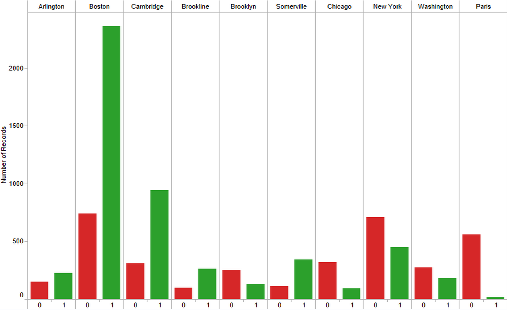
The first chart was location. We identified the intuitive result that people residing in Boston are far more likely to subscribe than individuals visiting from another location. However, there was also a fascinating insight that there are a substantial number of people visiting from Paris who have an extraordinarily low rate of subscribing. Users visiting from Paris represent a particular growth market for the Boston Globe.
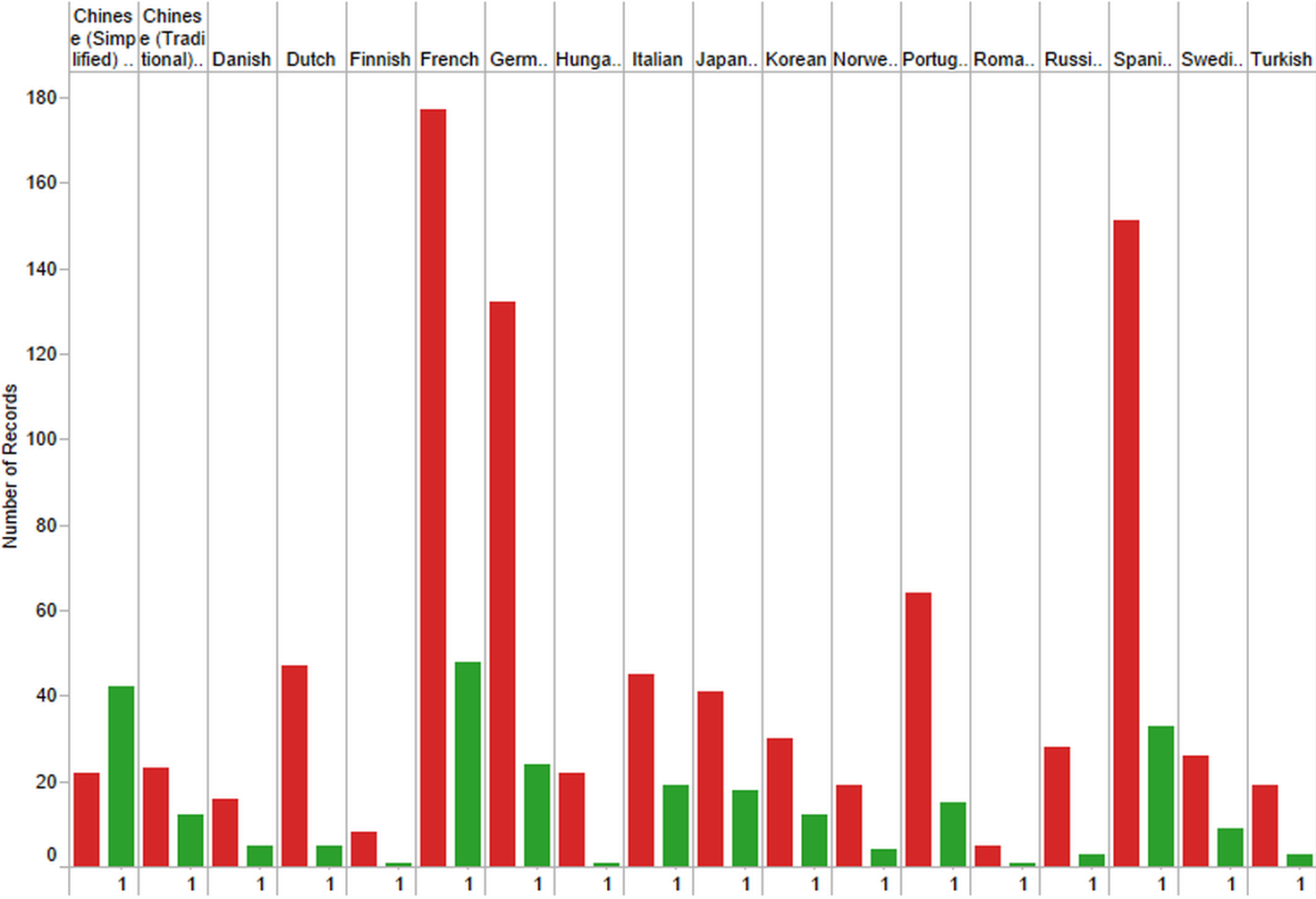
The second chart was based on a method we developed to decode the primary language of the user. We removed all users who had a primary language of English and then sought to work out what type of person will subscribe. We sorted down to the top 18 non-English languages. We found an unexpected insight. Every non-English language led to a lesser chance of subscribing - as seen by the non-subscriber count marked as 0 in red being higher than the subscriber count marked as 1 in green - except for one particular language: Chinese (Simplified). Users who speak Chinese (Simplified) also appear to represent a growth market for the Boston Globe.
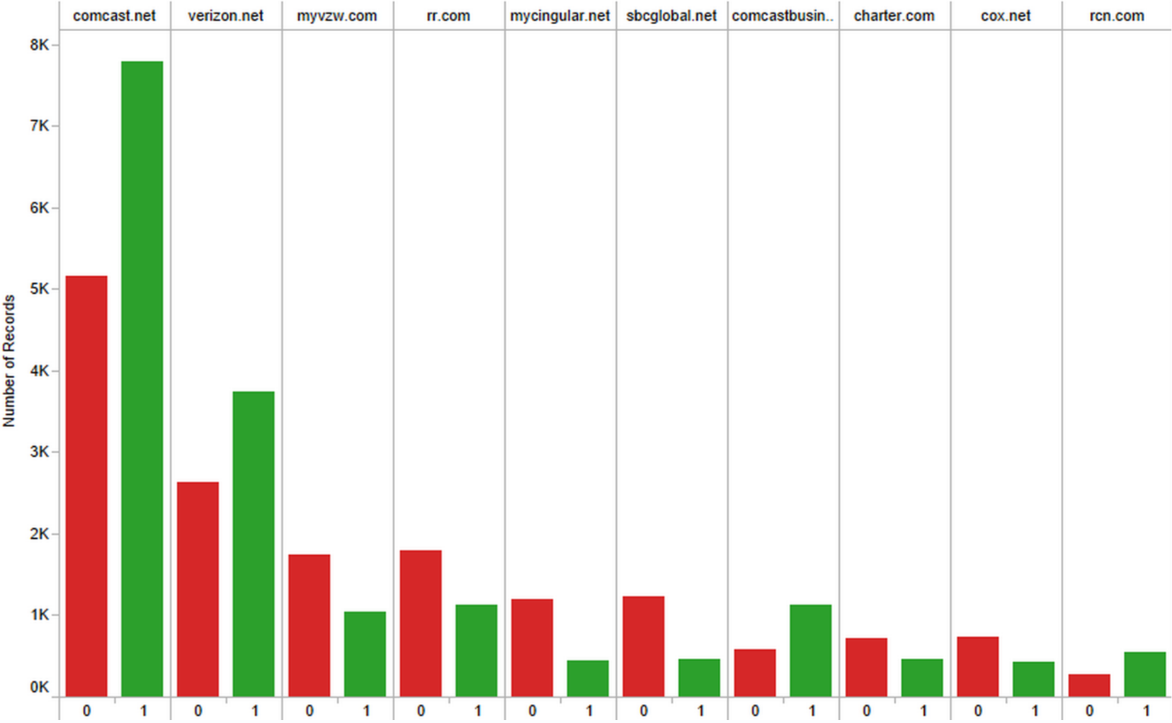
The third chart identified the user’s Internet Service Provider (ISP) as we thought visitors from premium-priced ISPs may have a higher propensity to pay for a subscription. We found this to be the case as users from Comcast, Verizon, and RCN were more likely to subscribe than other providers.
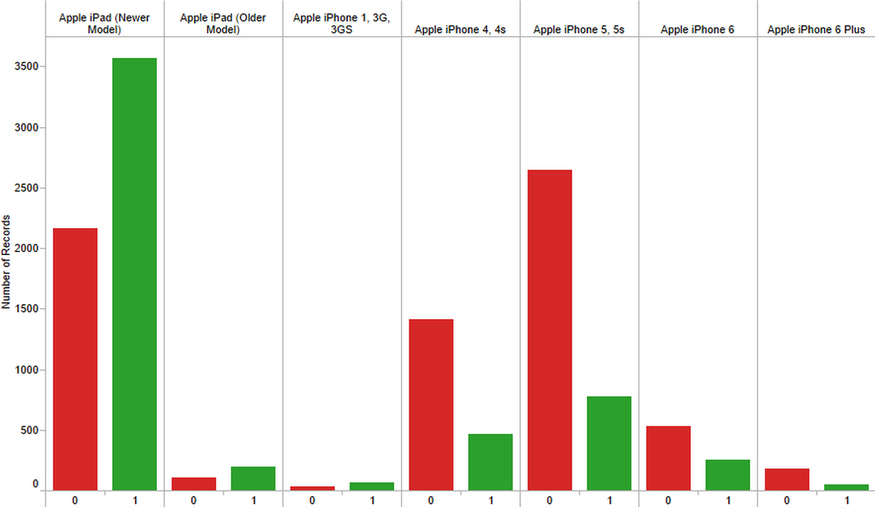
The fourth chart was based on a method we developed to decode the specific user device in use. Using various pieces of information and combining them together using a set of logic rules, we were able to deduce specific models of devices. Again, following our premium-pricing hypothesis, we focused on Apple devices thinking that Apple users may have a higher propensity to pay for a subscription. We were surprised to find that only a specific model line of Apple products is more likely to pay for a subscription: Apple iPads. In hindsight, we realized this makes intuitive sense since it is more pleasurable to read the Boston Globe newspaper on the larger screen size that the Apple iPad offers.
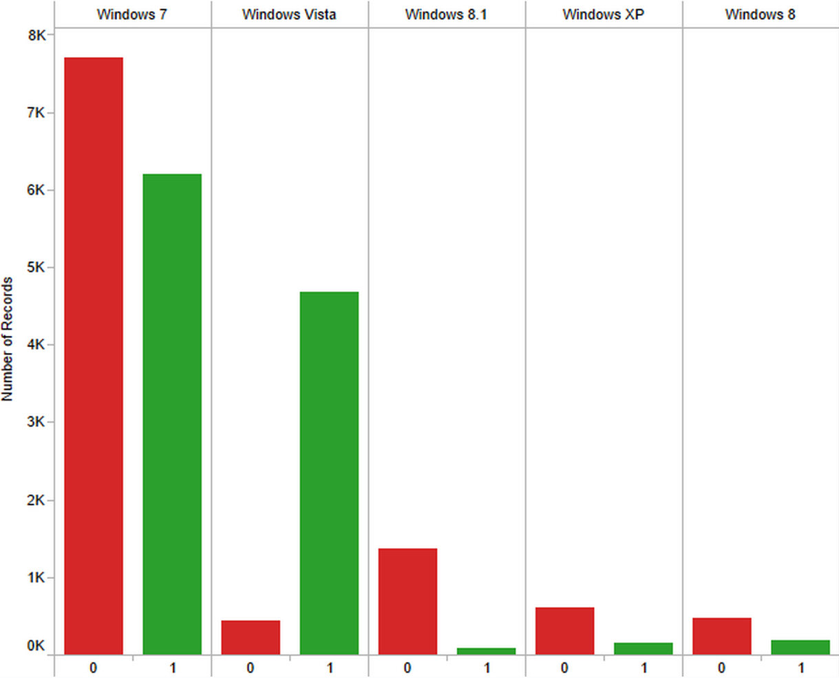
The fifth chart was based on another method we developed to decode the specific Operating System in use. For PC users, we deduced the version of Microsoft Windows in use. It was our hypothesis that visitors using older versions of Windows are more likely to subscribe as this indicates they are less likely to be on the cutting-edge of technology and know of cookie deletion techniques to advance past the free article viewing limit. We found this theory particularly supported by the unexpectedly high proportion of Windows Vista users choosing to subscribe versus all other Windows users.
When do users subscribe?
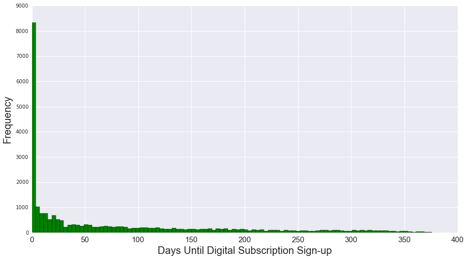
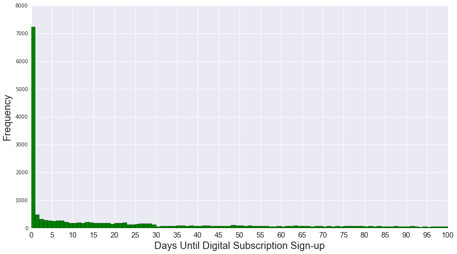
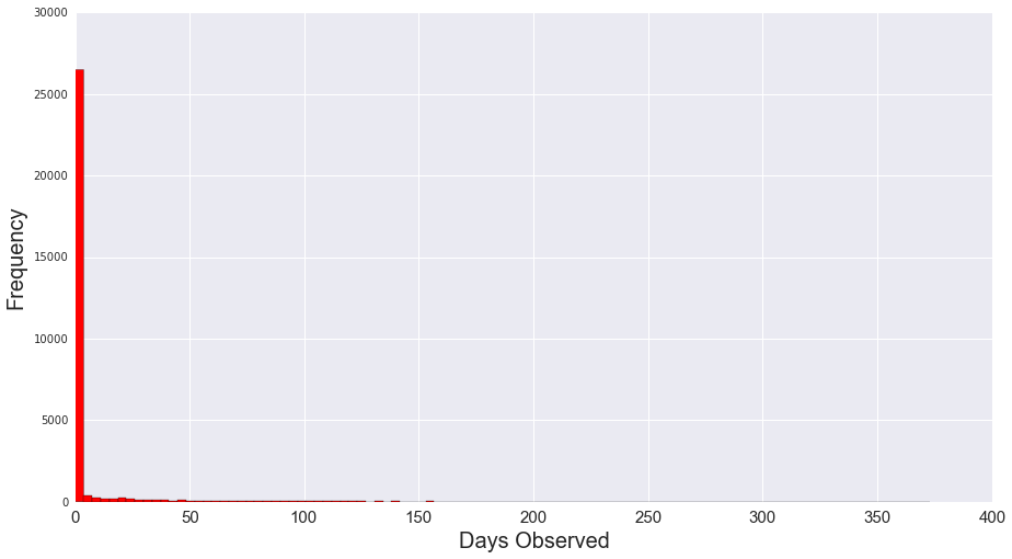
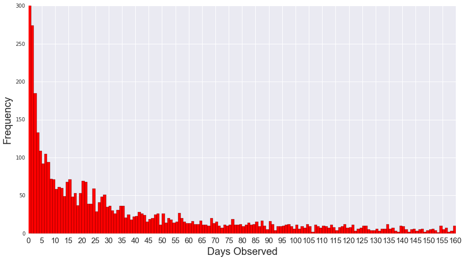
We were interested to understand when do subscribers sign up. Our hunch is that a higher proportion of subscribers would be in the system compared to non-subscribers since users would take a period of time to decide whether to become a subscriber. The figure below shows the distribution of days until a subscriber signs up for Boston Globe. As we can see, there is a surprising amount of users who would sign up in the first day. The rest are distributed with decreasing proportion as time increases, with most signing up in the first 50 days of landing on the site.
We also took a look at non-subscribers and, not surprisingly, most of the 30,000 non-subscribers are only in our system for around 1-3 days. These non-subscribers are most likely coming from one-off visits from Facebook or Twitter referrals.
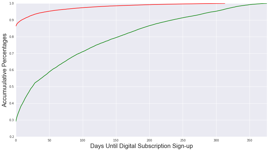
Below, we show another perspective of the two histograms above. Here, we take the cumulative percentages. As we can see in the figure below, by the fifth day, approximately 60% of the 25,000 subscribers have signed up; while, approximately 95% of non-subscribers only have visited for 1 day.
How many times do users hit the paywall cap?
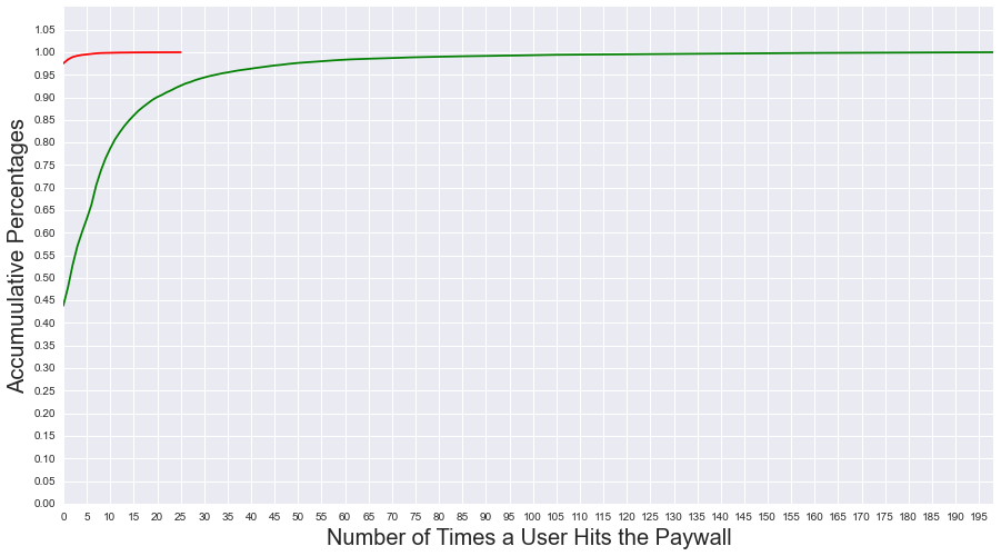
Every month, users receive 5 free articles on Boston Globe. Upon reaching the 5 article cap, the paywall sets in and prompts users to sign-up to enjoy unlimited articles. We were interested to see if there is a difference between the number of times a user hits the paywall cap between subscribers and non-subscribers. Our intuition is that users that eventually do become subscribers should hit the cap multiple times and decide to sign-up to access unlimited articles. While, users that do not subscribe are those who do not hit the cap since they only one or two articles a month


From the figures above, we can see that there is a high number of users who became subscribers that hit the paywall ceiling multiple times prior to signing up. Next, we took a look at the corresponding non-subscribers


Not surprisingly, users who did not sign-up within our study period did not hit the paywall celing many times. Again, we plot a cumulative plot to juxtapose the subscribers with non-subscribers
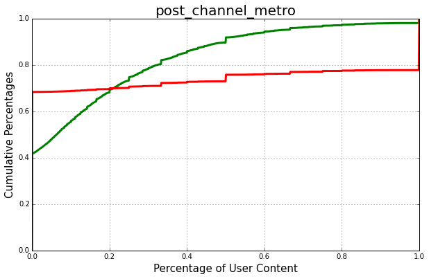
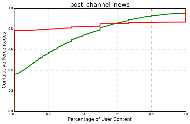
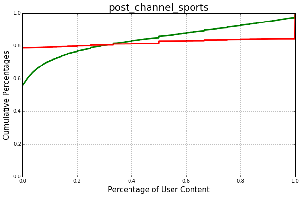
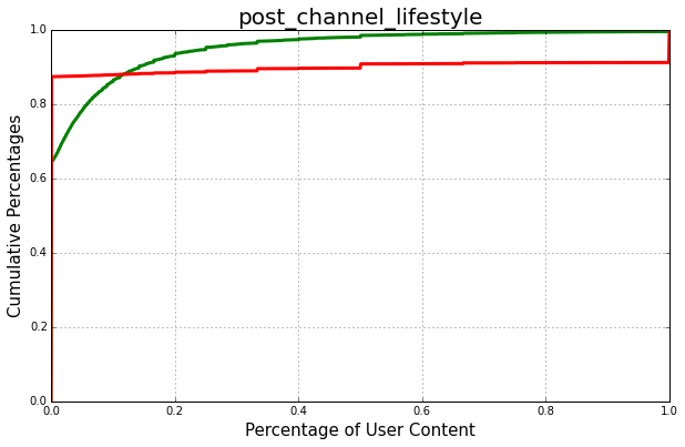
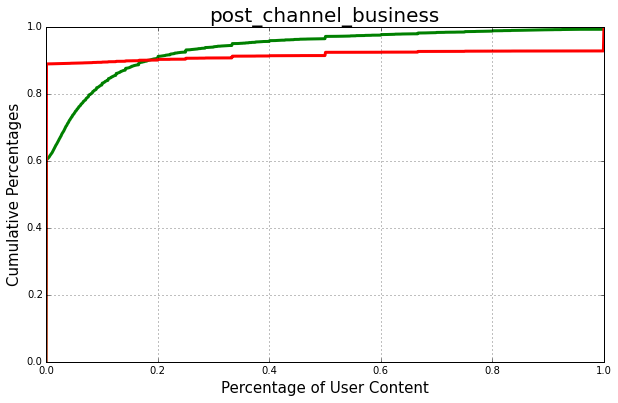
What content do people read?
The feature 'post_channel' described the content of a certain webpage, which is a good indicator of a visitor's taste. However for each visitor, the content is not static, and it behaves as a random variable. Therefore, we collapsed multiple observations corresponding to one visitor and get a content distribution. We can draw conclusions about people's preferences of media contents as below. The plots are represented as a cumulative distribution functions.